Edited Newspaper Stories in Today's Comic Books
- Jermayn Parker
- Jan 31, 2020
- 2 min read
For a lot of Frew readers from the 1980s and 90s, the work that Jim Shepherd and Frew did by bringing to us unedited and uncensored newspaper stories was all part of the reason why many including the team at Chronicle Chamber were and still are hooked on the Phantom.
In the December Comics and News X-Band podcast in a discussion between Mikael, Dan and myself we highlighted how even today the newspaper stories get edited in comics from Frew and Egmont which is a direct 180 on what Frew readers received in their comic a few decades ago.
The first example is in the Fantomen issue 25&26/2019 and the 2019 Christmas Album. You can view the edited panels either in the gallery below with the edited panels along with the original. Or you can view our YouTube video (attached below) from the 1 hour and 7 minute mark.
The obvious question is what reads better?
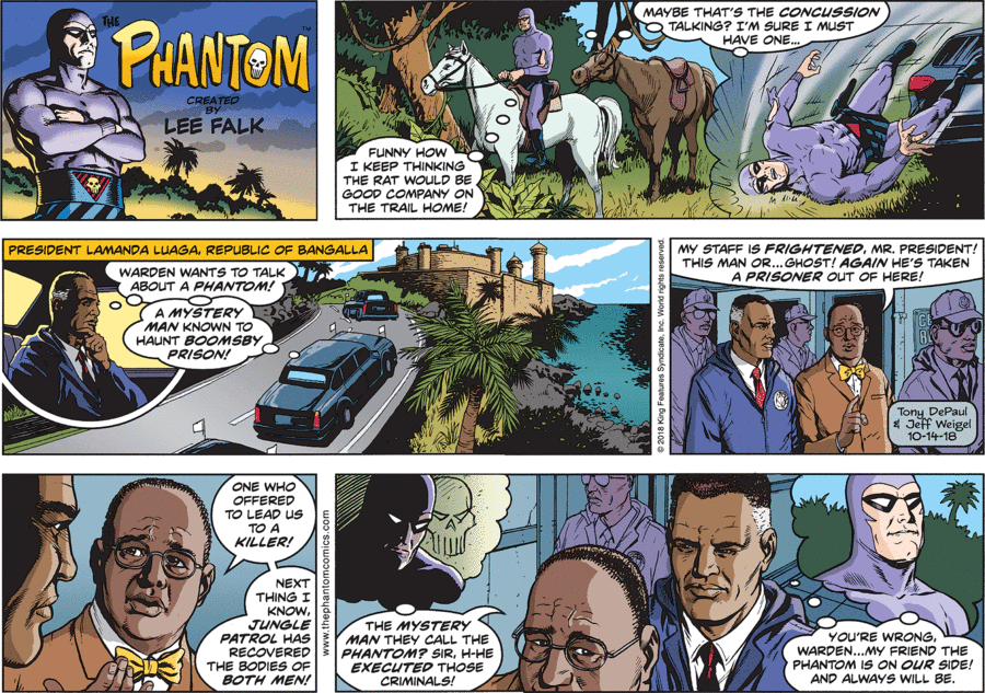
This is not a problem just isolated to Egmont either. In the following examples we see some edits in the proportion of the way the panels are shown across Newspapers from Australia and comics from Fantomen and Frew. Thanks to Anthony Gillies for the photos.
The original is the first image. Frew’s height to width ratio is .657 (second image). Fantomen published at a height to width ratio of .651 (Third image). The Sunday Canberra Times height to width ratio is .89. The worst example is the Sunday in the Sunday Canberra Times newspaper which is squarer resulting in giving the warden a distorted elongated head (Fourth image).
While the proportion of what the Sunday Canberra Times do is almost criminal, at least they still publish the Phantom with many other newspapers cancelling the comics and the Phantom.
If you look at the comic book examples in the images above or have picked up Frew issue #1856 (Frew Christmas special) or Fantomen 25-26/2019 yourself, you would have noticed that both do not include the top line of the three tiers which includes the unique title image and generally the 'for those who have come in late' reminder catch up panel.
Many will argue that the story reads better with the title image and previous recap being removed but many will also argue that it is not a true representative of what was originally published.
What side of the fence do you stand on? Do you prefer your newspaper stories edited to a more readable comic story or do you prefer them unedited in the newspaper format?
A huge thanks to Anthony Gillies and Mikael Lyck for their help with photos, scans and some technical help in this article.


